Texas Rangers World Series Banner Striked Out
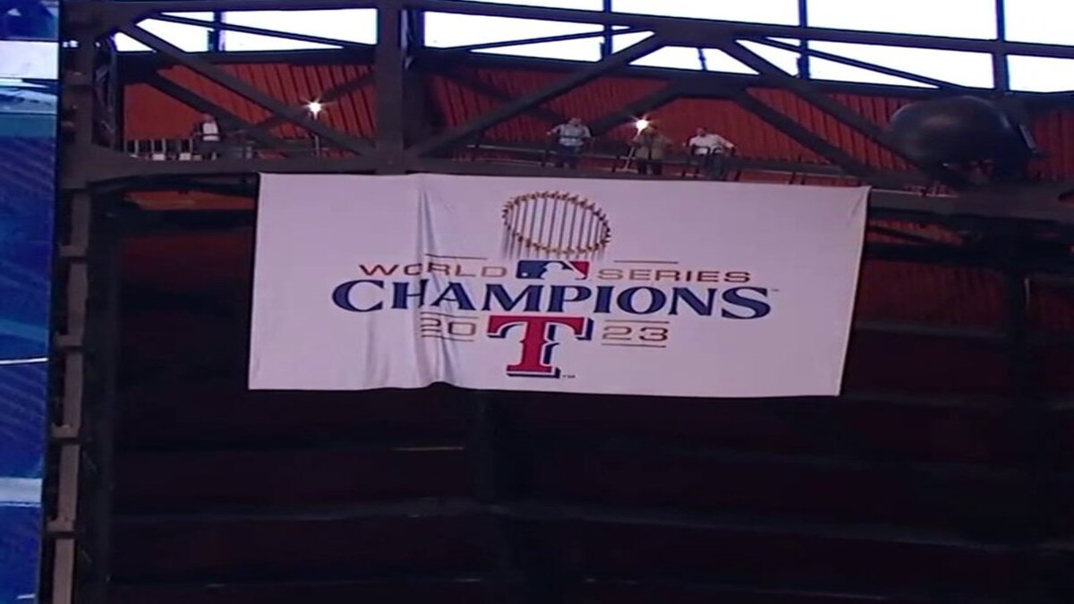
The Texas Rangers aimed to celebrate their historic 2023 World Series victory with a triumphant banner unveiling at Globe Life Field. However, their attempt at a commemorative masterpiece struck out with fans, sparking a firestorm of criticism on social media. Let’s dissect the design elements causing this online uproar, explore potential reasons behind the misstep, and analyze the public’s reaction.
Off-Center Applause: Design Choices Leave Fans Feeling Left Out
The most glaring critique centers on the banner’s unbalanced composition. The focal point, “2023 World Series Champions,” sits significantly off-center to the left, leaving a vast expanse of empty white space dominating the right side. This lopsided layout throws off visual harmony and creates a sense of incompleteness. Social media has been flooded with comparisons to poorly framed photographs or unfinished websites.
Adding to the disappointment is the absence of a specific Texas Rangers logo. Instead, the banner features the generic MLB logo. While acknowledging the league context, it fails to capture the spirit of the Rangers organization and its dedicated fanbase. Fans crave a design that celebrates the unique identity of their team, capturing the excitement and pride of the championship win.
A Fan-Made Nightmare? Speculation Fuels Frustration
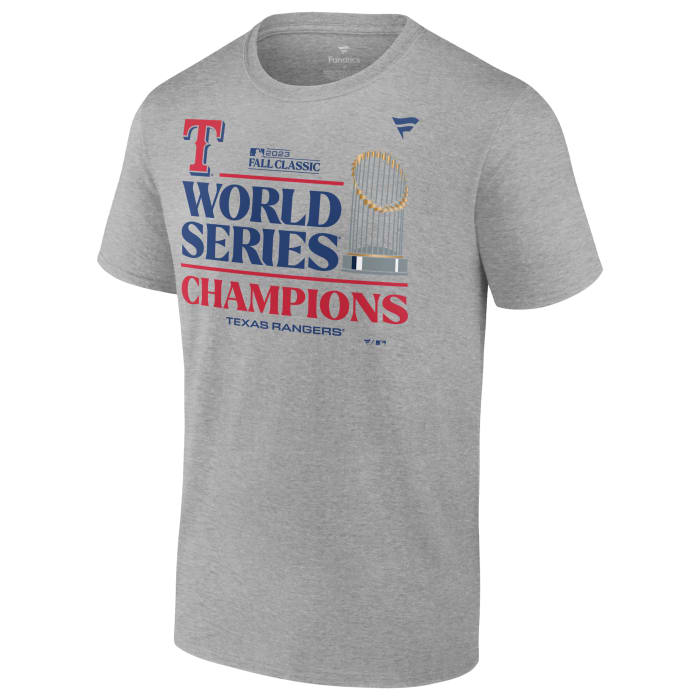
The situation escalated further when speculation arose that the banner was designed by Fanatics, a large sporting goods retailer known for mass-produced merchandise. While unconfirmed, this suspicion resonates with fans who perceive the design as lacking creativity and a personal touch. Many point to well-received fan-made designs circulating online, showcasing balanced layouts, the Rangers logo, and creative typography. The stark contrast between these fan creations and the official banner highlights the perceived shortcomings of the professional design.
From Confusion to Mockery: A Social Media Swing and a Miss
— Chas 🦖 (@Chaz11963) March 28, 2024
— Alex🧀 🦌 (@CheeseHerd) March 28, 2024
The unveiling of the banner sparked a flurry of reactions on social media, ranging from bewildered confusion to outright mockery. Here’s a breakdown of the online response:
Confusion: Many fans were initially perplexed by the design choices. The unbalanced layout and generic logo left them questioning if it was a temporary placeholder or the finished product.
Disappointment: Once it became clear this was the official banner, disappointment set in. Fans expressed a sense of letdown, feeling the design failed to do justice to the team’s momentous achievement.
Mockery: As disappointment settled, a wave of satirical humor took hold. Memes and photoshopped images flooded social media, poking fun at the banner’s flaws. Some even compared it to clip art projects gone wrong.
Current Status:
As of today, the Texas Rangers organization has remained silent on the fan backlash. The controversial banner continues to hang at Globe Life Field. However, the online conversation shows no signs of slowing down. Fans hope the organization will acknowledge their concerns and potentially consider a redesign.
The Texas Rangers must listen to their fans when designing their World Series banner. Fans’ opinions matter a lot. By considering what fans want and staying true to the team’s style, they can fix the mistake and make a banner that shows off their 2023 Championship win to their loyal supporters.
Here are FAQs
Q: What’s wrong with the Texas Rangers’ World Series banner?
A: The main criticisms include an unbalanced layout with a large empty space, the use of a generic MLB logo instead of the Rangers logo, and a perceived lack of creativity compared to fan-made designs.
Q: Did Fanatics design the banner?
A: This is unconfirmed speculation, but it fuels fan frustration over the perceived generic design.
Q: How did fans react to the banner?
A: The online response ranged from confusion and disappointment to mockery, with memes and photoshopped images highlighting the design flaws.
Q: Has the Texas Rangers organization responded to the criticism?
A: As of today, the organization has remained silent. However, fans hope they will acknowledge the concerns and potentially consider a redesign.
Q: What can the Rangers do to improve the situation?
A: Engaging with fan feedback, incorporating their suggestions, or even holding a design contest, could help create a more representative and well-received banner.
Read More >>https://trenditweetz.com/alabama-vs-north-carolina-basketball-march-madness-sweet-16/


